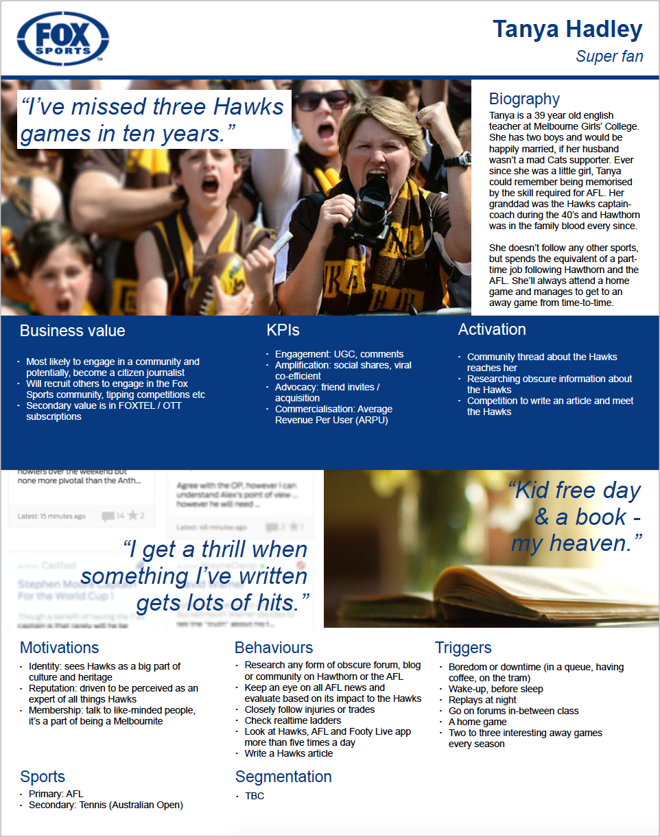
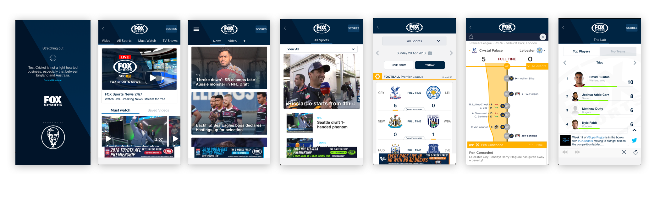
FoxSports App Re-thinking the content discovery experience for mobile users

Bringing back the excitement


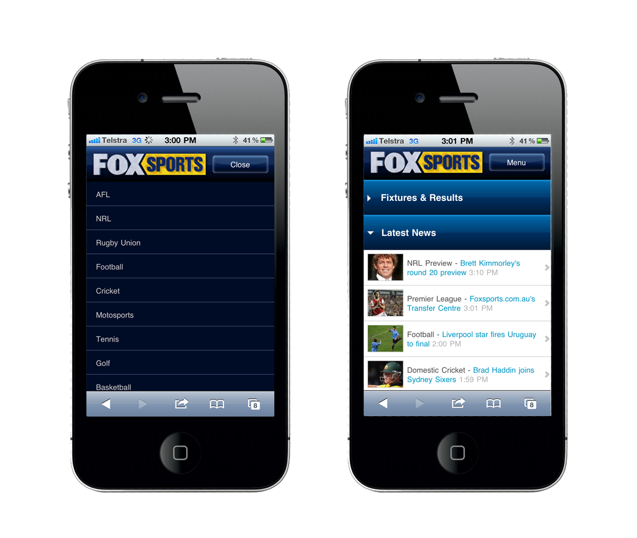
In 2011, whether it's reading the latest sport news, checking last night's NRL scores or watching sports highlights on the app felt magical.

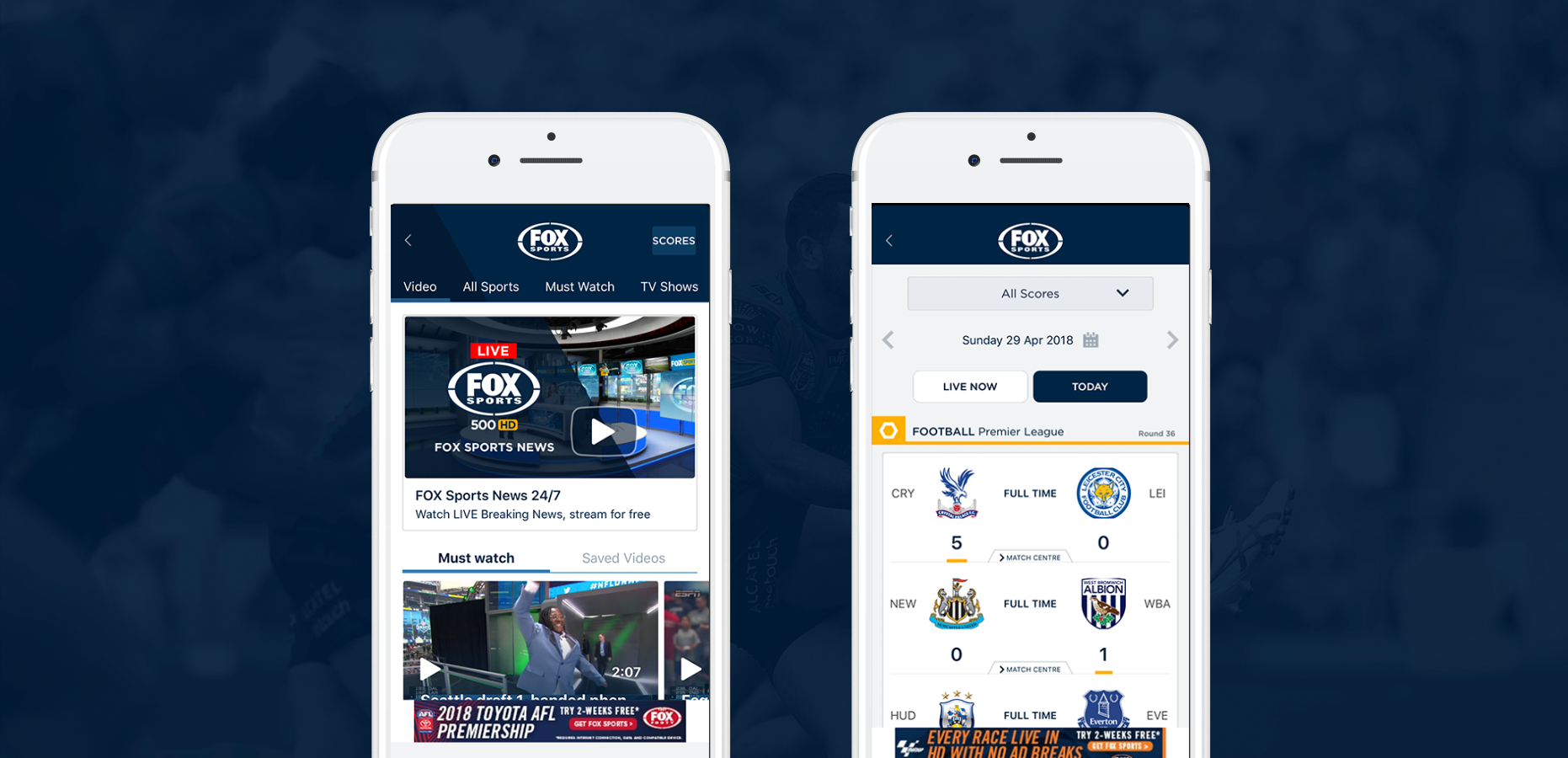
By the start of 2016, this magic receded to a slew of complex features that made the experience slow and diffcult to use.

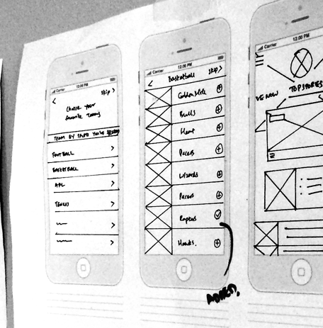
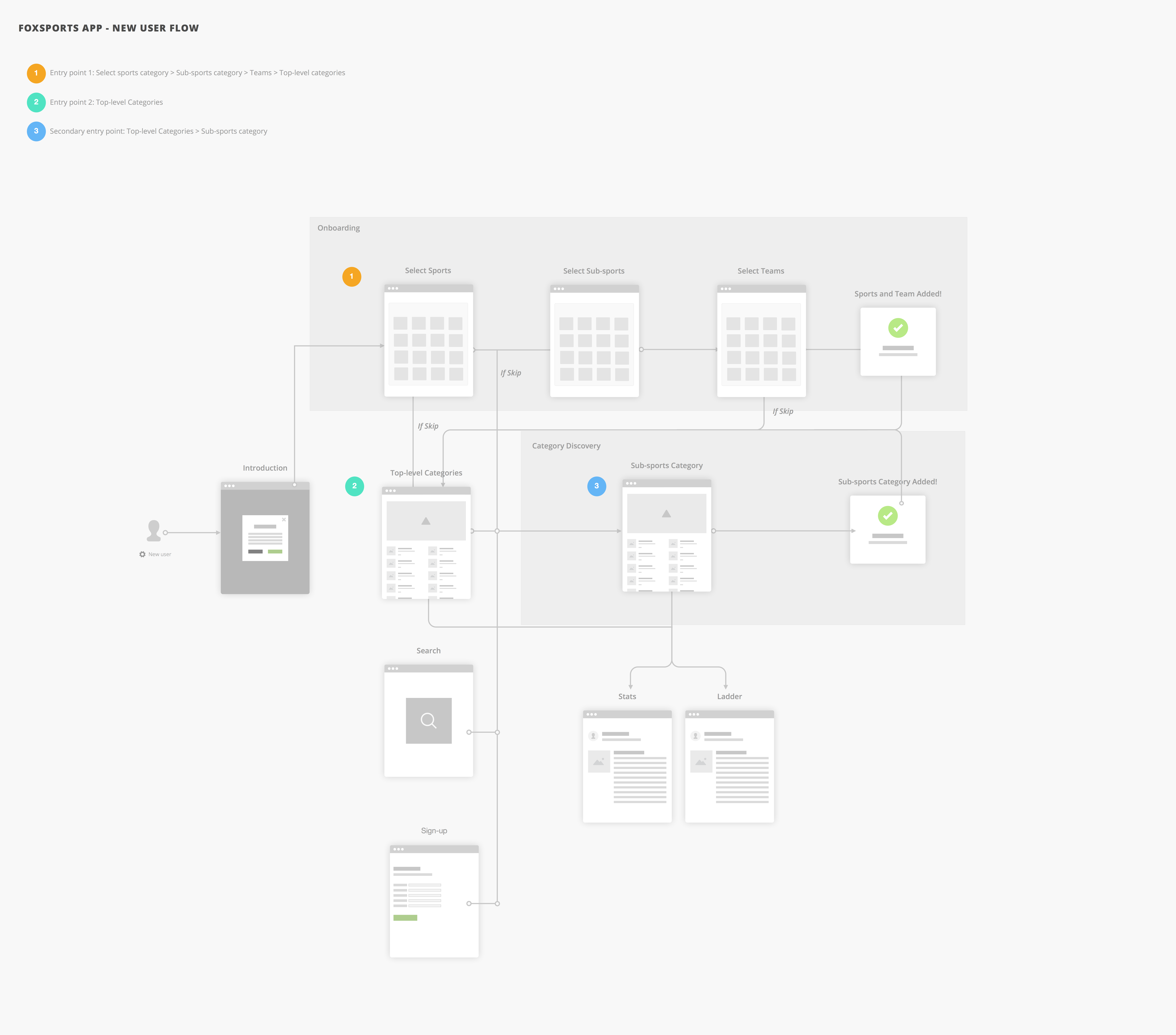
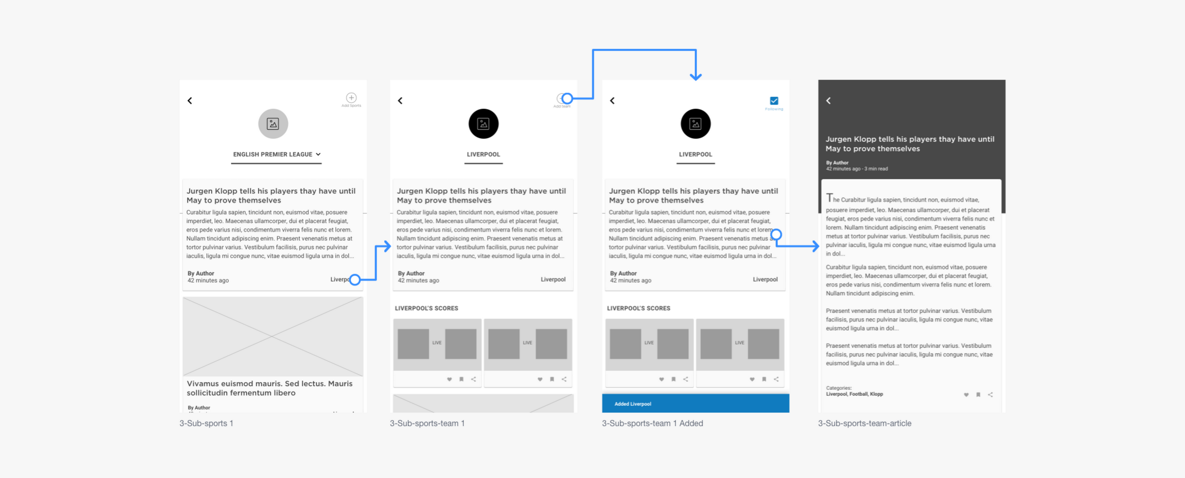
I was part of an ambitious project to redesign the Fox Sports App sports consumption experience.

Synopsis

I was tasked to rethink a new experience for the Fox Sports app. The first step was to check ‘under the hood’ for obvious issues. I found more than I asked for..


Techniques

Persona Creation, User Flows, Wireframe, Prototyping & Usability Testing.


My Role

Lead UX Designer


Team

Derrick Heng

The Challenge

To improve the engagement and content discovery through personalisation and notifications.


Tools Used

Sketch, Invision, Principle, Keynotes


Device

Mobile only


Project Duration

4 months

Fox Sports App

The Legacy


Since 2011, Fox Sports Australia has been on a mission to shift their sports content towards the digital space. For over 20,000 TV box subscribers this means having access to sports content on the App, tablet and website.

The Fox Sports App, first designed in 2012 struggled to scale alongside the hyper-growth of the company. Fundamental usability was challenged as disparate features and contents competed for focus. App reliability and performance issues increased exponentially.

The Fox Sports app had became an information pyramid.

Evolution of the Fox Sports App since 2011.

Discovery

Unpacking the problems

Before jumping into solution mode, it was important to check ‘under the hood’ for obvious issues. With abundant access to data and customer’s feedback, I’ve found 4 major issues that were recurring.

Four major pain points were quickly identified:

1. Videos are poor in quality

2. Matches that are not playing on time

3. Ads were too disruptive during the match

4. Onboarding & Content discoverability was poor

Defining scope


From a UX perspective, on-boarding, content discoverability and match timings have the highest user/business impact and the least effort/time to implement as there’s no video production involvement and requirements.

Therefore, it was clear to the team that these problems should be addressed as part of MVP.

In order to have shared understanding amongst product managers, designers and developers, I've reframed the above problem statements.

Problem 1:

"Customers could not easily discover contents of their favourite sports or teams."

Hypothesis 1:

"So if we provide users the ability to add their favourite sports or teams as they browse articles and videos, they can discover new curated content much easier. We will see an increase in engagement and customer satisfaction."

Problem 2:

"Customers are not able to watch live matches on time."

Hypothesis 2:

"So if we provide users the ability to set reminders before a match starts or receive notifications when there’s a match delay. We will see a decrease in complaints."

Research

Competitive Studies


In order to provide an effortless on-boarding process that allow users to customise their experience, I turned to the market and started researching similar apps.

Almost all sports app goes through a similar on-boarding process e.g. first pick your favourite sports then pick your favourite teams. That said, not all sports app provide users the ability to control and personalised their teams as they browse the app or set notification for matches they want to watch.


Personalisation and content discovery was the key focus for both power users and new users.


Who's our target audience?

Primary Personas


The audience for this initiative are focused on sports fanatics who are always on the go. Therefore, viewing sports content on mobile will is a major part of their daily consumption habit.

Two specific personas were derived:

1. Sports Super Fan - Dedicated to a sport or a team

2. Sports Disruptor - Socially active across sports media — primarily mobile


Ideate

Onboarding — a thing of the past


In an age where everything is demanding your time, I’ve designed the FoxSports app to give your time back by making personalisation effortless, fast and contextual.


Therefore, I’ve made personalisation an ongoing behaviour; where sports or team can be added to your favourites whilst browsing through articles, scores or watching a video on your favourite teams.


By aligning with user’s navigation behaviour, personalisation can be extended through browsing sports category, team or player tagged on the content.


FoxSports App reborn


After 8 sprints, the new FoxSports digital app was born. It makes sensible decisions for you — informing you in ways that are understandable and actionable.

Credit to the Fox Sports Visual design team.

The Impact

Positive results


The test was done with 10 participants with specific tasks to test both hypothesis. Where the first 5 participants were shown the current design before the new design. Then the sequence was re-ordered for the next 5 participants to eliminate default effect.

Findings for hypothesis 1:

Users found the setting up process simple to understand e.g. with sports and team selection.

They thought the on-boarding flow was what they expected. Using simple checkboxes to select multiple sports and teams is an easy way to personalise. The top nav horizontal design also helped browsing the contents efficiently.


"In the new design, looking from left to right works more naturally..Top nav is layout in an obvious manner so everything is easy to find."

"Add sports and teams are very easy in the new design."

"In the current design, contents are in the menu and you have to look for stuff."

Most of them love the idea of ‘My Sports’ Collection and the idea of adding teams as they browse. This allowed them to find contents on their favourite teams easily.

Users found sub-category in the drop-down menu and ‘+’ sign to add content very straightforward.

Adding content on the new design was much easier, all users had some trouble customising their sports in the current app.

Most users liked to control what contents are added in their collection and are easily accessible.

"Easier with the new design as there is new content with a 'plus button' that helps me identify adding new content. The current design, I can't differentiate which are my contents vs available contents to add."

Reflections


Always ask yourself, are you solving the right problem?

Invalidated assumptions will always stay as assumptions.

Keep teams small.

Own the experience.


Thanks for reading