WEBMD The leading source for health and medical information.

WebMD wants to increase its user acquisition and retention
as competition in the online health space is increasing rapidly.

Synopsis

WebMD has come to an understanding that users have difficulty parsing through its massive collection of content. Through user research and user-centred techniques I created better personalised experience across multiple user touch points.


Techniques

Interviews, Surveys, Competitive Analysis, Personas, User Story and Journey, User flow, Feature Prioritisation, Sketching, rapid prototyping, Interactive Wireframe, Usability Testing and Results.


My Role

As a member of a UX team of three. I was responsible for the conducting user research, sketching user flows, developing interactive wireframes, and delivering the overall experience strategy of the new desktop site. I collaborated with my team mates to produce all major deliverables and presenting them to the client.


Team

Miriam Steenhauer, Morgane Borzee, Derrick Heng

The Challenge

Identifying what would lead to a more personalised WebMD experience.


Tools Used

Typeform, Sketch3, Axure, Illustrator, Photoshop, Keynotes, Paper


Project Duration

3 weeks


Device

Desktop website

Empathise

The Discovery


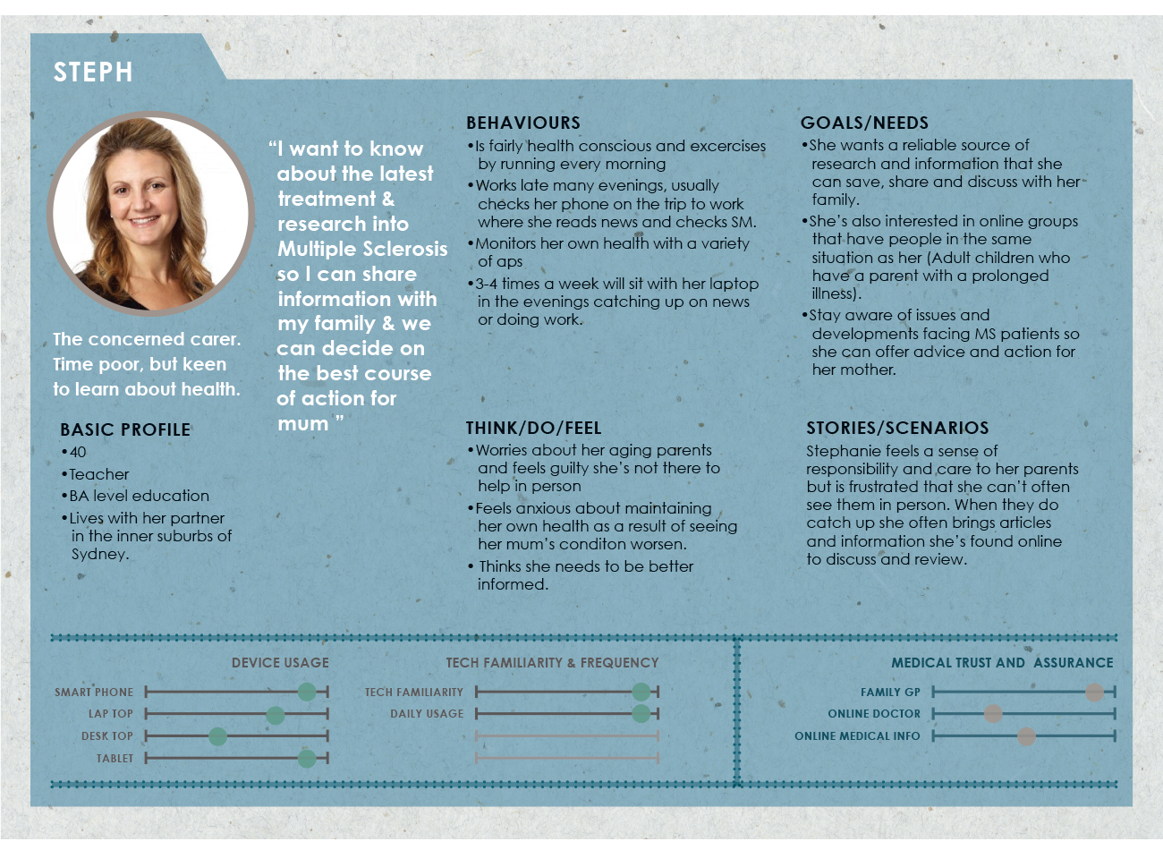
First we had to understand how people currently seek and manage their personal health information.


Company & Market research

We started with company research to learn about the company’s history, culture, customers, brand, and it’s value proposition.

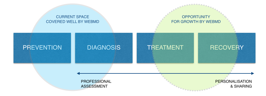
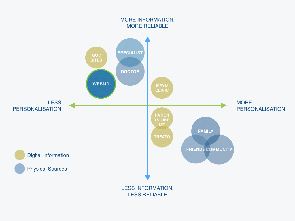
We also compared a list of predominant healthcare players, including non-digital healthcare players like family, friends, doctors etc to better understand where WebMD is positioned in contrast with other trusted sources.


User research

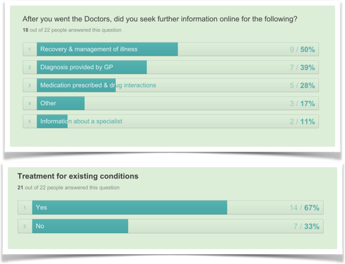
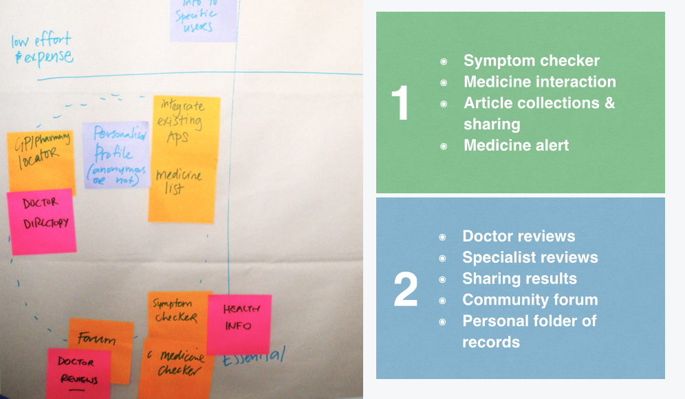
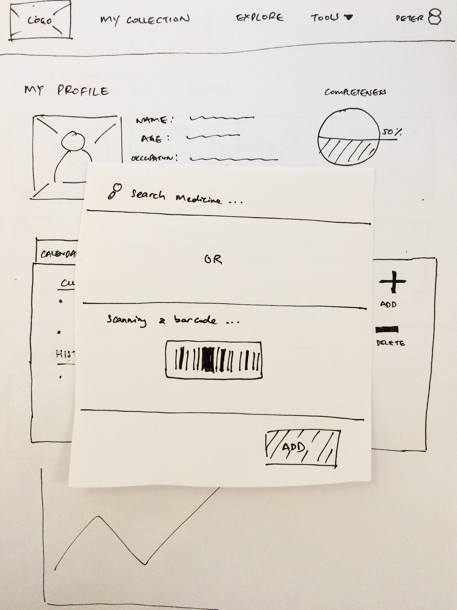
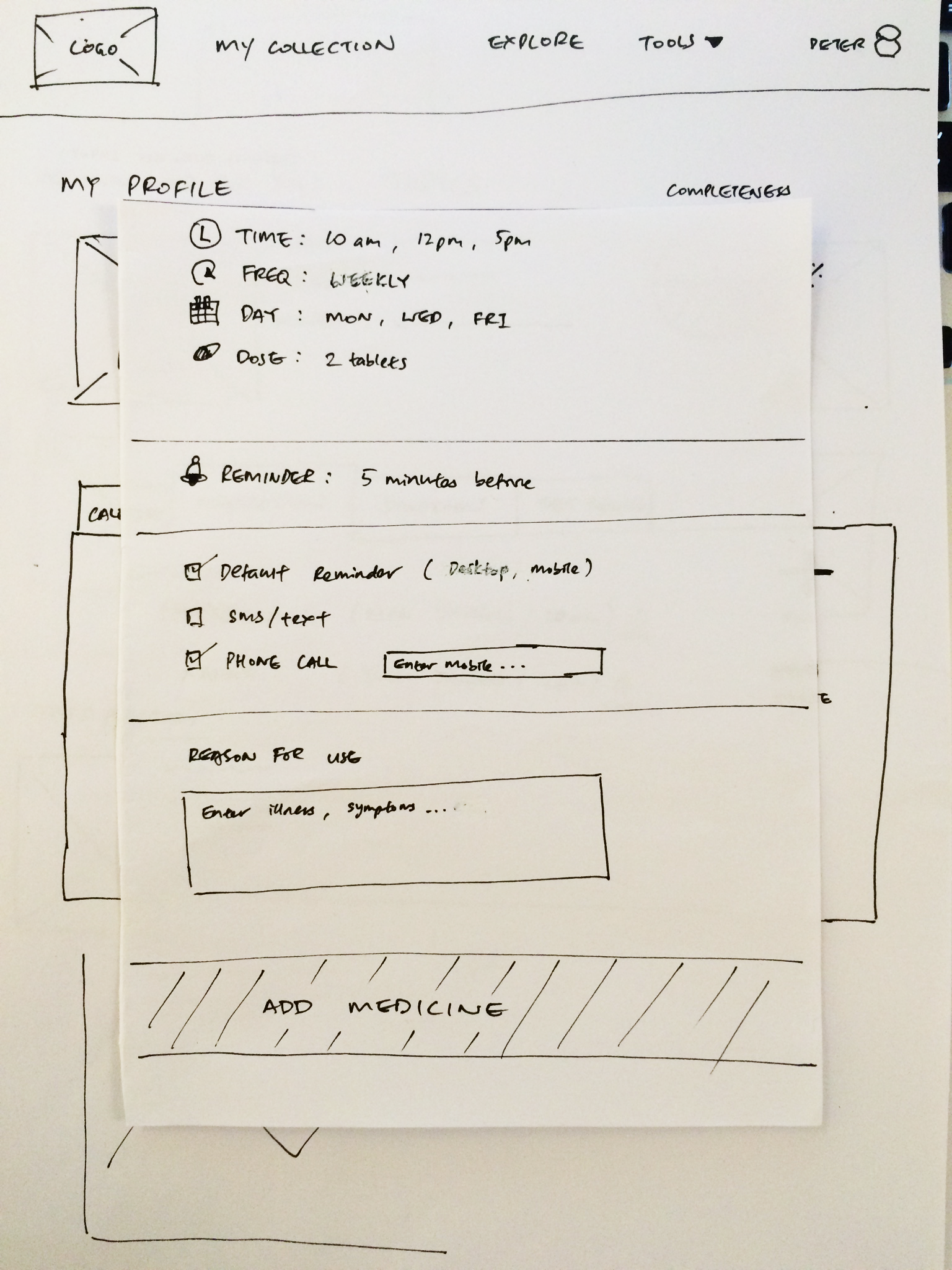
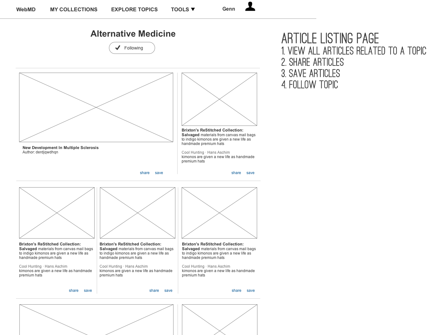
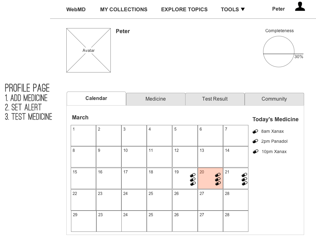
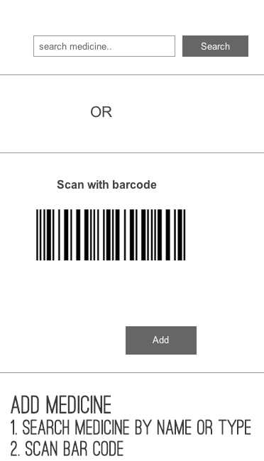
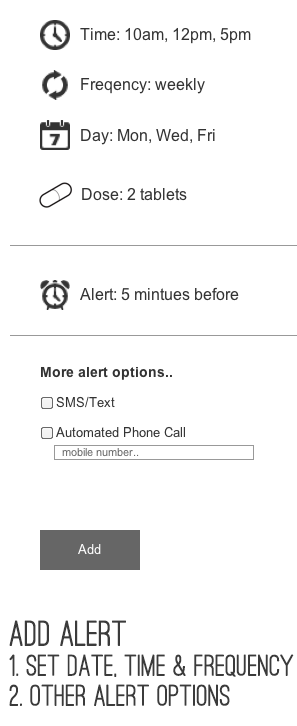
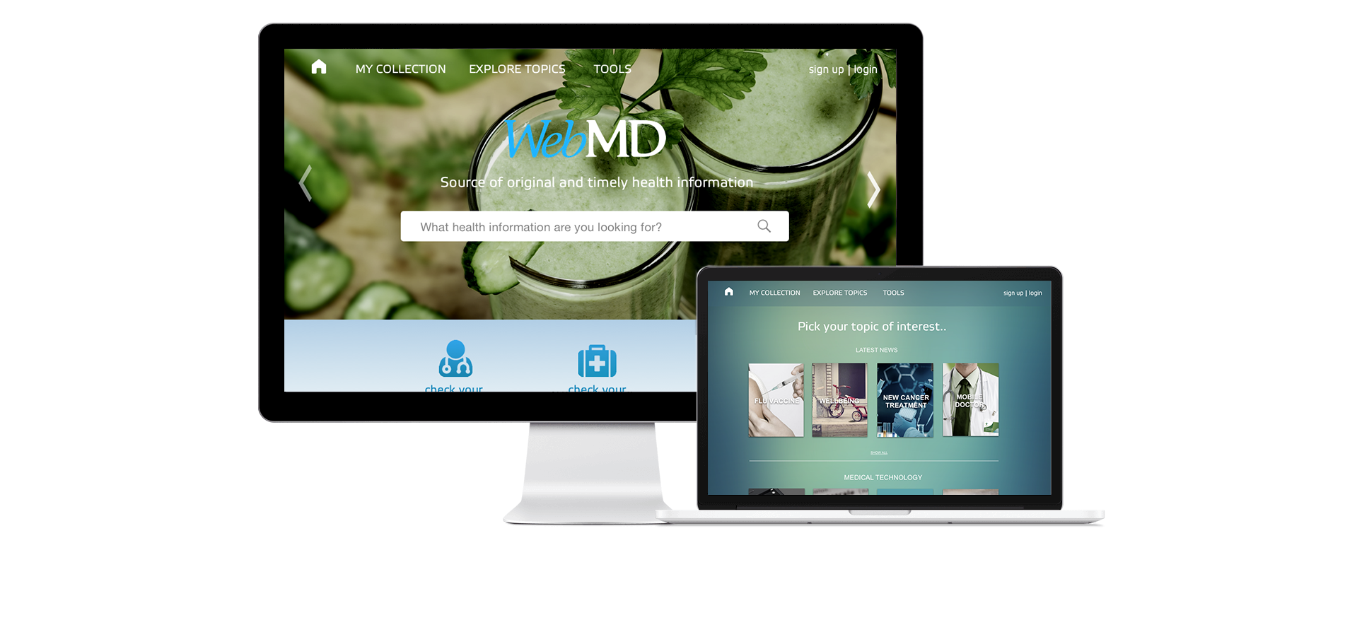
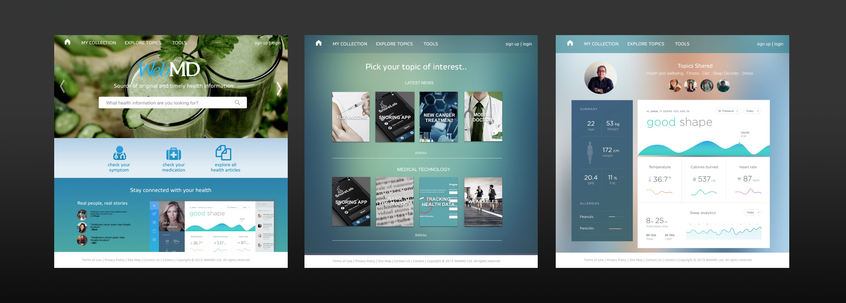
We knew that WebMD have a wealth of medical information but users are having trouble getting to them. Before starting designing an aesthetically pleasing site, we needed to understand how people currently seek out medical information online relevant to them or when helping others.


Insights from the research could provide relevant cues allowing us to design for their underlying behaviour as opposed to focusing on improving cosmetics.


Hence we started outlining key assumptions by asking the 5 W's.


"These hypothesis shaped key questions for our survey and interview."


Insights


We received 28 responses from our survey and conducted 4 interview sessions.


Treatment & recovery

Interestingly we found a large proportion of people gravitated towards searching information for treatment and recovery. People are exploring, managing and recovering from existing illnesses. This is particularly prevalent for long-term and serious illnesses.

Curate & Share

Our feedback from surveys and interviews suggest although reliability of sources and privacy was an issue, people are willing to share their medical info if it helped others.


“If it could help someone else in the same situation, then why not?” -A medicare customer

Define

Re-Defining The Goal


WebMD require a revised approach to its existing content in order to attract and retain users.

We have identified that by personalising information and creating opportunities to collectively share knowledge, individuals and research communities could benefit.

User Goal

To curate, share and gain valuable information relating to their purpose.

Business Goal

To improve customer experience focusing in the treatment & recovery space.


Designing for what users want to know, do & feel


"After synthesising data collected from our research, we created an empathy map looking through user’s lens to understand their story."


"This allow us gain a deeper understanding of their major frustration points."


Creating Personas & Scenarios

Understanding major frustrations through empathy mapping, we created four personas. Followed by creating scenarios for each persona to ensure our design supported the user's behaviour.


Keeping high-level scenarios allowed us to work fluidly and explore concepts that we could easily communicate with. They also formed the backbone of our designs.

Strategy & Scope


Our next step was to determine which features are in scope, aligned with the overall goal and addressed our personas pain points.


Feature Prioritisation

Using the personas and user research we had done, we chose the most appropriate platform to explore and started to define the features that a minimum viable product would need to have.


We prioritised WebMD's current features and new features based on the most essential and lowest effort of implementation.

Given the timeframe, it was not feasible to implement all essential features in our design hence we decided to split them into two phases.

Ideate

Conceptualisation


With the key features narrowed in phase one, we focused on sketching out a few ideas to support the user journey for three scenarios.


Rapid Prototyping

Early sketches exploring different navigation patterns for the homepage. We compared, discussed and selected sketches that best supported our user scenarios and overall objectives.


DESIGN TEST & ITERATE

As we progressed through a the stages, we had iterated and refined our designs.


Conducting a task analysis enable us to understand how are users completing the task e.g. using the search function to find a particular health topic, navigating through the menus, etc,. This excercise also validated our design ensuring it supported each task.


"Gathering feedback from initial sketches we could identify problems earlier, allowing us to iterate our designs before developing wireframes."


Prototype & Testing

THE INTERACTIVE FRAMEWORK


Once we have tested and iterated our early sketches, we developed the interactive wireframes and performed a second task analysis with three users.

Article Browsing & selection


Keeping track of medications


"This time we introduced sub-tasks in our usability testings focused around interactions and secondary features of our wireframes."


Findings & Implications

Based the feedback received from our usability testing we iterated and improved on the overall design.

These included:

  • Medical terminology were very foreign to users. We had to consider using simpler, understandable contents and adding tool-tips in the design.
  • When browsing for topics, users would like to see article contents before signing up.


"From the feedback received, our design addressed user's pain-points by creating a personalised experience across multiple touch points."


The Outcome

Simplifying the Journey

Meeting user & business objectives

MAKE IMPORTANT THINGS FAST & OBVIOUS

The main screen designed for quick access to the primary features that were hidden behind sub-menus. This can be seen on the main page.

PERSONALISATION & ORGANISATION

The new design also allow users to curate, collect, manage and share their medical contents.

Additionally, within the profile page users can track, manage and share their health status with a personal dashboard.

Next Steps


The overall feedback was positive as we have identified new areas in the treatment and recovery space which led to a more personalised WebMD experience.

This formed an integral part of the design as it sets precedence for users to manage and share their own medical records with patients experiencing similar illnesses in phase 2.


Phase 2

  • Build an online medical community that facilitate sharing of medical research and health information relating to illness.
  • Including doctor, specialist and hospital reviews as a part of the community. Creating an impetus for contribution, discussion and sharing of treatment & recovery information.

Reflections


Identifying fundamental problems early sets a foundation for your feature requirements.

Less, but better.

Start testing and iterate early.

Identifying obvious & consistent problems early.

You are not your user.


This project was conducted as a part of the User Experience Design Immersive course at General Assembly.