IPART Re-designing an Australian Government platform that provides independent regulatory decisions and advice on public prices such as transport fares, energy bills and various Government charges to protect the ongoing interests of the consumers, taxpayers and citizens of NSW

Synopsis

I was engaged by a creative agency to re-think the future platform for the Independent Pricing and Regulatory Tribunal of New South Wales


Techniques

Heuristic Evaluation, Persona Creation, Sitemap, User Journeys, Wireframe, Prototyping & Usability Testing.


My Role

Expert review of the current site. Persona and sitemap research, sketches and


developed an interactive wireframe that conveyed an improved user journey.

Team

Derrick Heng

The Challenge

To create and design a site that aids comprehension and learning of IPART's value and benefits.


Tools Used

Sketch, Axure, Keynotes


Device

Mobile and Desktop


Project Duration

3 months

The Discovery

Unpacking problems


1. To validate whether there was a major problem, I dived into page flows, traffic and page visits of the site. I realised there was low engagement during discovery and review selection. Users are not able to easily locate a specific review and were stuck on the first page.

2. I uncovered existing usability issues and barriers to content discovery by reviewing the current IA. I also found multiple duplication of entry points and menus on the site (e.g. multiple navigation menus. x1 top menu, x2 menus on the right panel).

3. Also, there was not much context provided to users - i.e. what is the site about and what each review meant to them.

For instance on the current site, the title of the review doesn't provide much context as to what's a review, why there is a review, how it impacts the public, why iPART conducts reviews, and who is involved?

Validation framework

Defining the outcome

Before jumping into design, it was important to define success and understand what variable can be change in order to achieve the outcome we want.

We believe that:

Users are not using the site because they don't understand what it does and how to use it,

So by:

Simplifying the site structure and reducing elements on the page, we can surface relevant information clearly,

We will see:

An increase in comprehension and discoverability of the site, leading to more review submissions from the public.

Minimising noise


Reducing elements on the screen is always a challenge.

What information takes precedence?

What is the visual hierarchy for the page?


I often tie these questions back to empathy.
What is the user's end goal? What is important to them?


Focusing on what's important


If the user's end goal is to:

1. Learn about IPART and what reviews are - how might we aid comprehension?

2. Find a review - how might we improve discoverability?

3. Make a submission for a review - how might we minimise effort and save time for power users?

Simplicity & Speed

Starting from the end goal


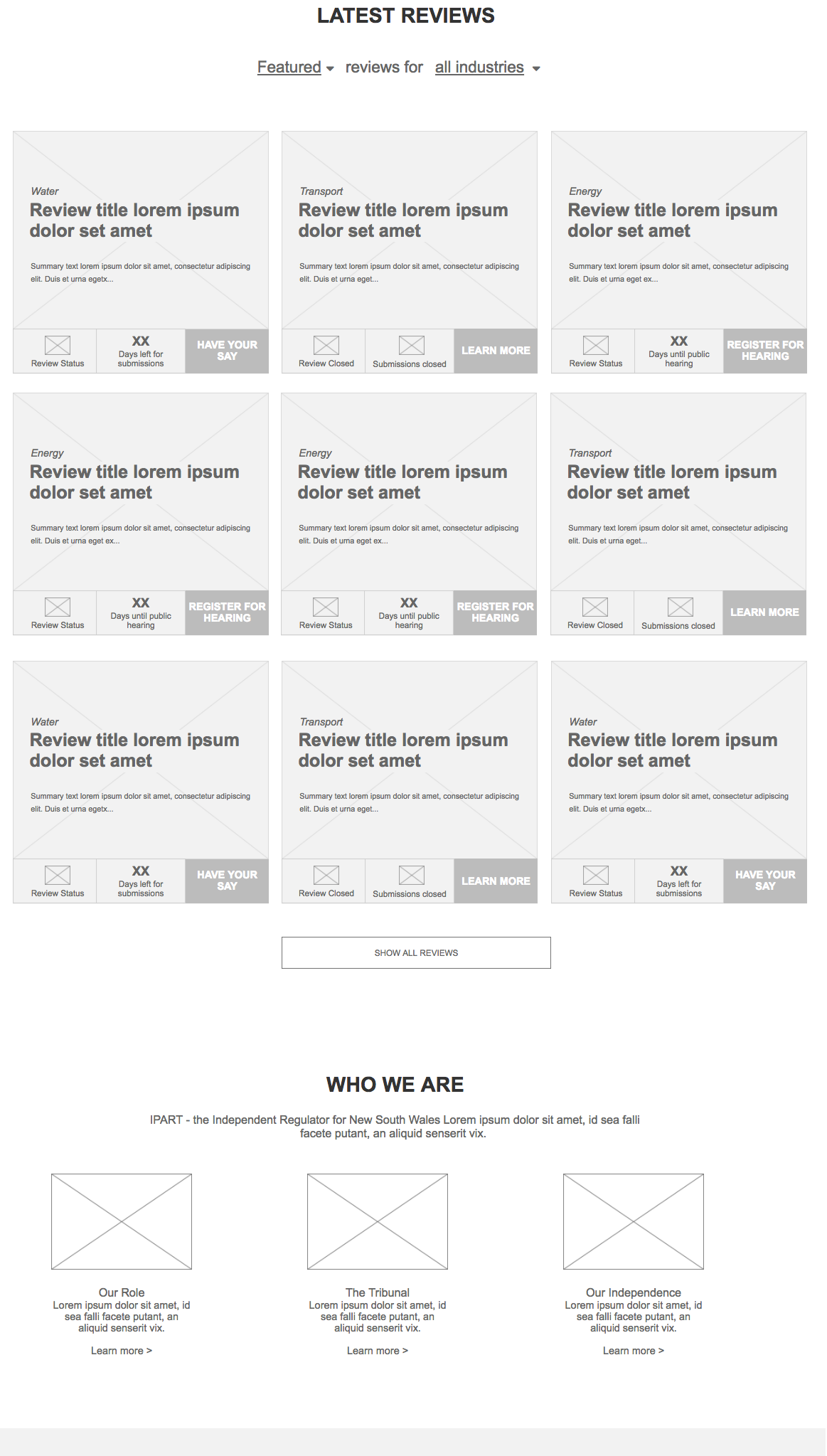
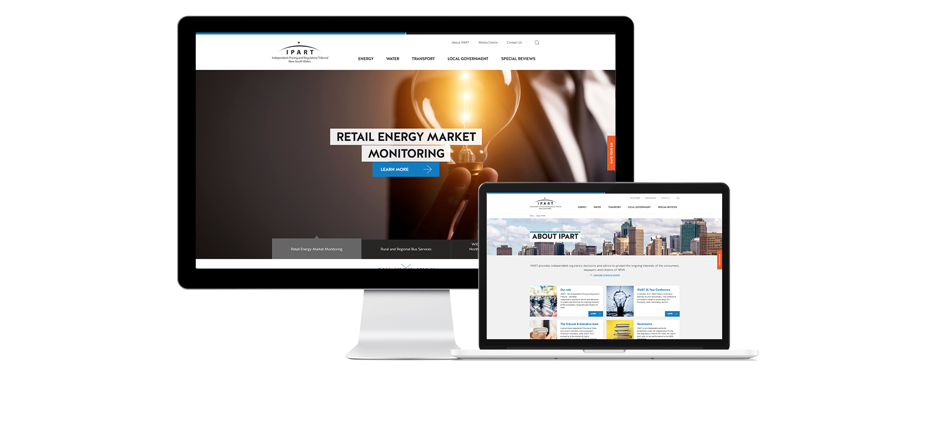
Since browsing, understanding and finding reviews are the main user goals, they should be the main call out of the page.

For existing users

In order to optimise the experience and aid discoverability, I decided to surface a list of reviews upfront of the page hierarchy as they are main focus.

Each review have a visual and tag representation of their category and a large filter to provide quick access to them. This minimises effort, allowing power users to quickly find a specific review.


Reducing each task’s steps for frequent users helps them achieve their end goal faster.


For each review card, I've included:

1. a summary that describes what the review is about,

2. a status indicator to show at which stages the review is at and how many days are left for submission.

3. a quick link so frequent users can easily send their submission with a click.
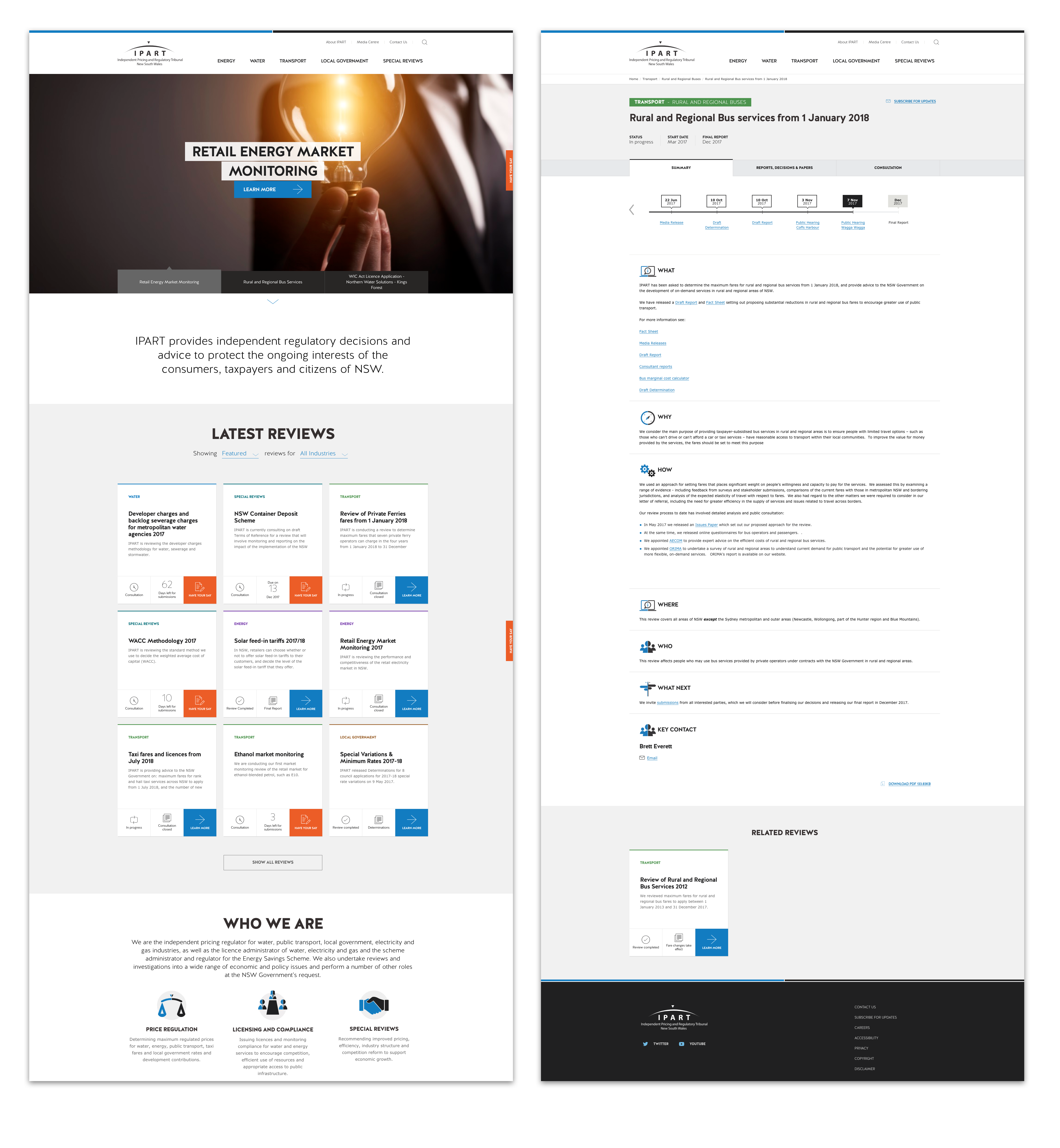
For new users

To improve comprehension, I exemplified the visual of each review as a hero image. As this is the first thing a user sees, a learn more CTA is presented for new users to learn what each review is about.

This is followed by a paragraph describing what IPART does and how it helps the community.

The launch

Final Outcome


In the 3 months after my involvement on the project, the team continued to evolve and polish the visual design, as well as finesse the finer functional details of the site. Although I was not part of this process, it was great to see most of my work brought to life.


Ideate

User testing

After developing the wireframes, I conducted usability testing for various user scenarios that aligned with overall objectives. Keeping my prototype and user flows in mid-fidelity allowed quicker learnings and continuous improvements.


Reflections


Know your personas and cater your designs for them.

Anything not of immediate use is noise.

Get feedback early and iterate fast.