Singtel
A re-design of Singtel's new site, EasyMobile, offering customers with low-cost mobile plans.

Synopsis
I've applied human-centred principles to improve how users flow through the site from discovering to purchasing low-cost mobile plans.
Techniques
Competitive Analysis, Heuristic Evaluation, User Flow, Wireframe, Prototyping & Usability Testing.
My Role
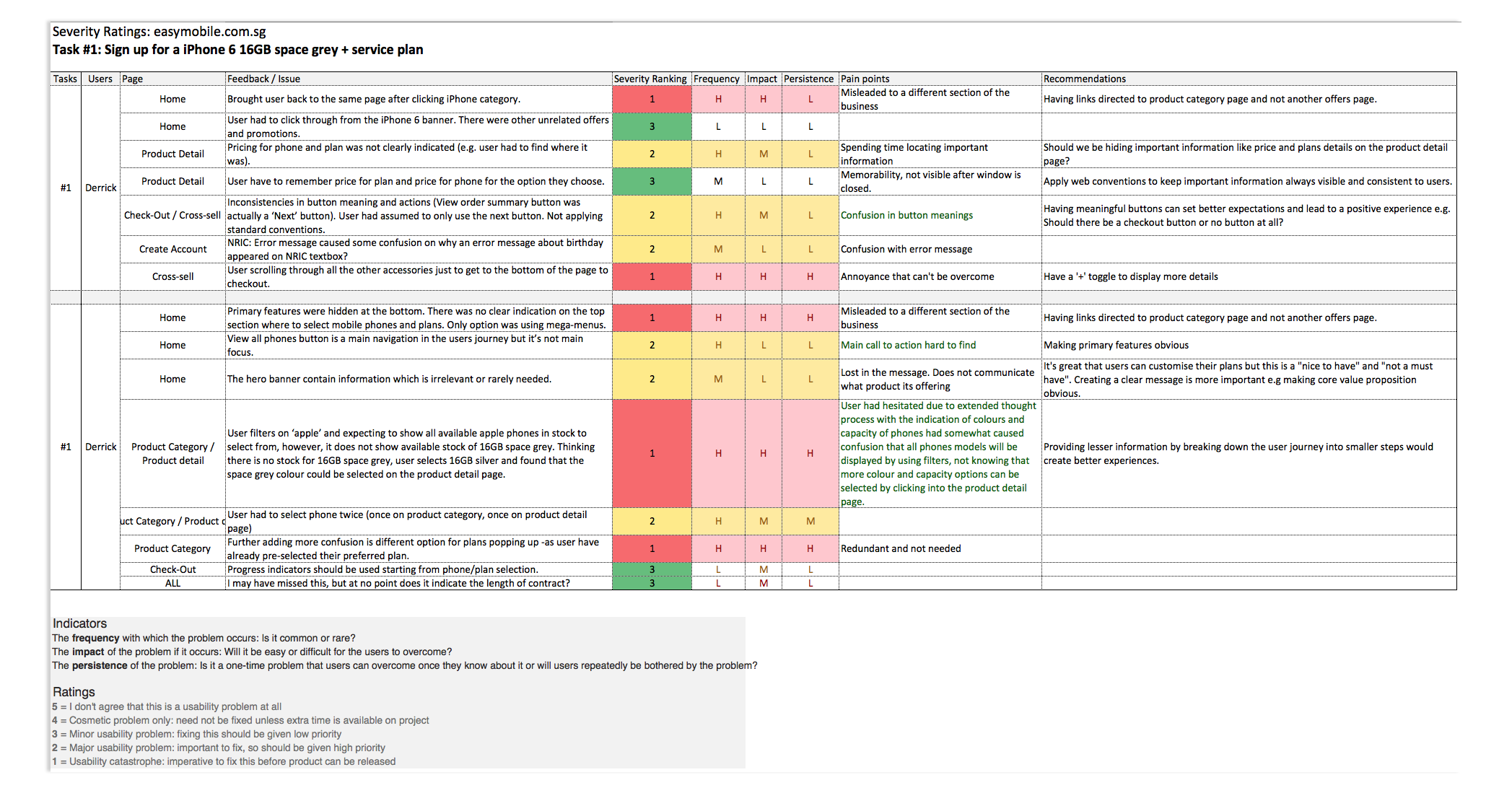
Evaluated the usability of easymobile.com.sg using the LEMErS framework to capture my findings. Started with a detailed analysis of how I completed a number of tasks.
Team
Derrick Heng
The Challenge
Data has shown a high drop out rate during the customer journey, with landing page showing the highest bounce-off rate. I am tasked to conduct an expert review of the portal and propose recommendations to improve engagement.
Tools Used
Sketch, Axure, Keynotes, Excel
Device
Desktop
Project Duration
7 days
My client, Singtel, had developed a new site that offer low-cost mobile plans. Analytics are showing high drop-offs on the landing and product listing pages.
During their analysis, they also realised there was low engagement during the discovery, selection and payment phase.
Therefore, I was tasked to conduct an expert review to uncover existing usability issues and provide a re-design using an interactive prototype that addressed barriers to content discovery and conversion in a one-week sprint.
LEMErS
An expert review was conducted using LEMErS principle. As a new user, I have given myself a task to complete:
Sign up for a iPhone 6 16GB space grey + service plan.
To complete a task, users often begin their journey in discovery and exploratory mode. I have scored each usability barrier and complexity that hindered discovery on a scale of 1-5.
1 = Usability catastrophe: It's imperative to fix this before product can be released.
5 = I don't agree that this is a usability problem at all.
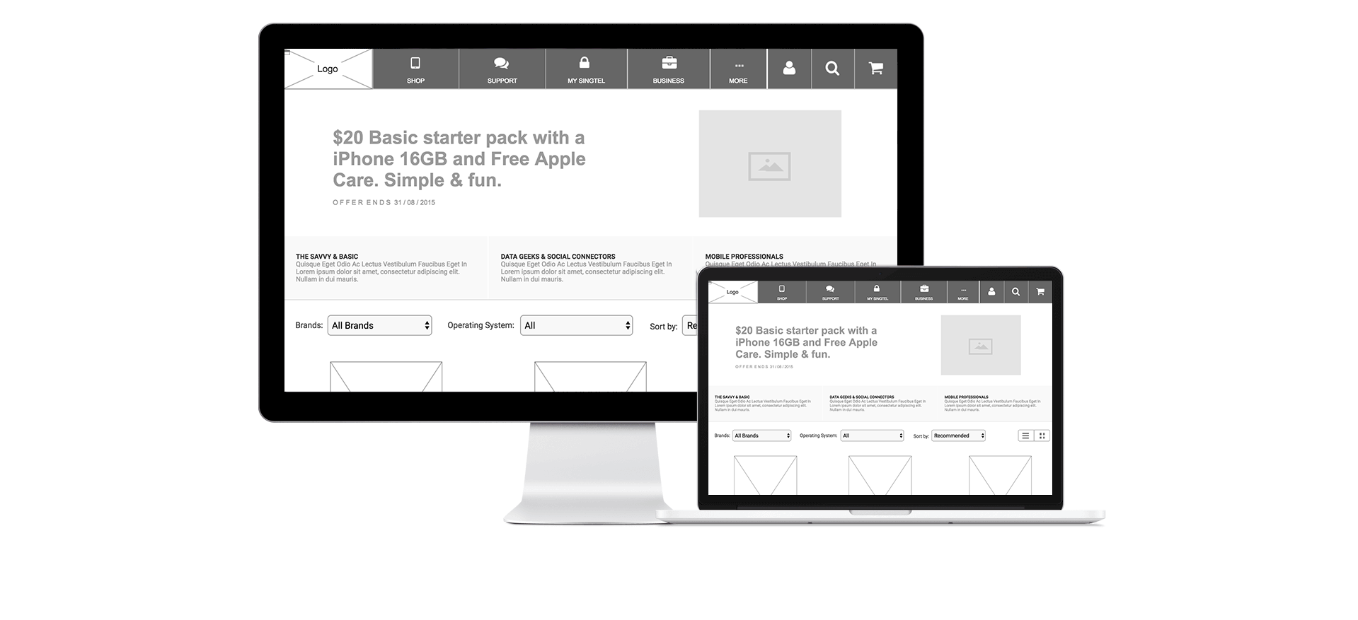
- Recommended viewing on Tablet or Desktop -
Revisit
I mapped out a new user journey which addressed major usability issues found during the site evaluation.
Then revised the user journey focused primarily on clearer entry points and removing noise that inherently obstructed users from completing their task, therefore, keeping the overall journey succinct was key.

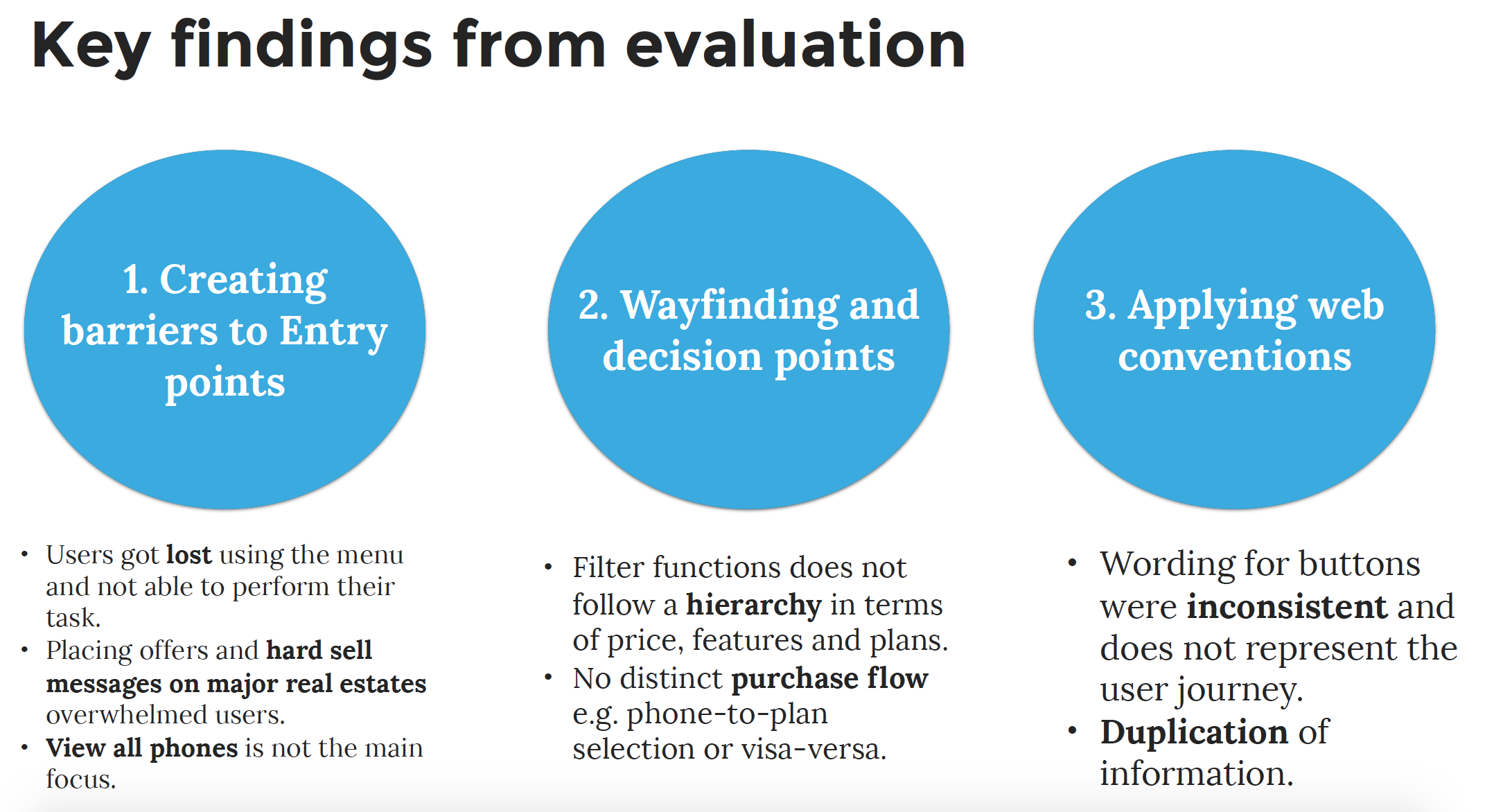
Overall Findings
Based on the evaluation, the site had offered a great value proposition for customers to customised their plans based on personal usage e.g. customers can personalise their plan based on data, talk-time and sms.
However, this offering wasn't clearly presented as part of the user's purchase flow and mixed with other content noises like ad banners and similar CTAs.
Define
As there is a need for users to select the phones + plans they desire, easily and efficiently.
I defined 3 hypothesis that my design could be validated on:
Users want help addressing purchasing frustrations - Wayfinding, selecting, deciding and paying.
Users want to be treated differently when flowing through the site - Tailored offerings by segmentation and providing staged-disclosure objects.
Users want to have a delightful experience across touch-points with the brand.
Narrowing
With the pain points and hypothesis in mind, I've brainstormed potential features and solutions to addressed them.
Narrowing features based on must-have's, could have's and won't have's
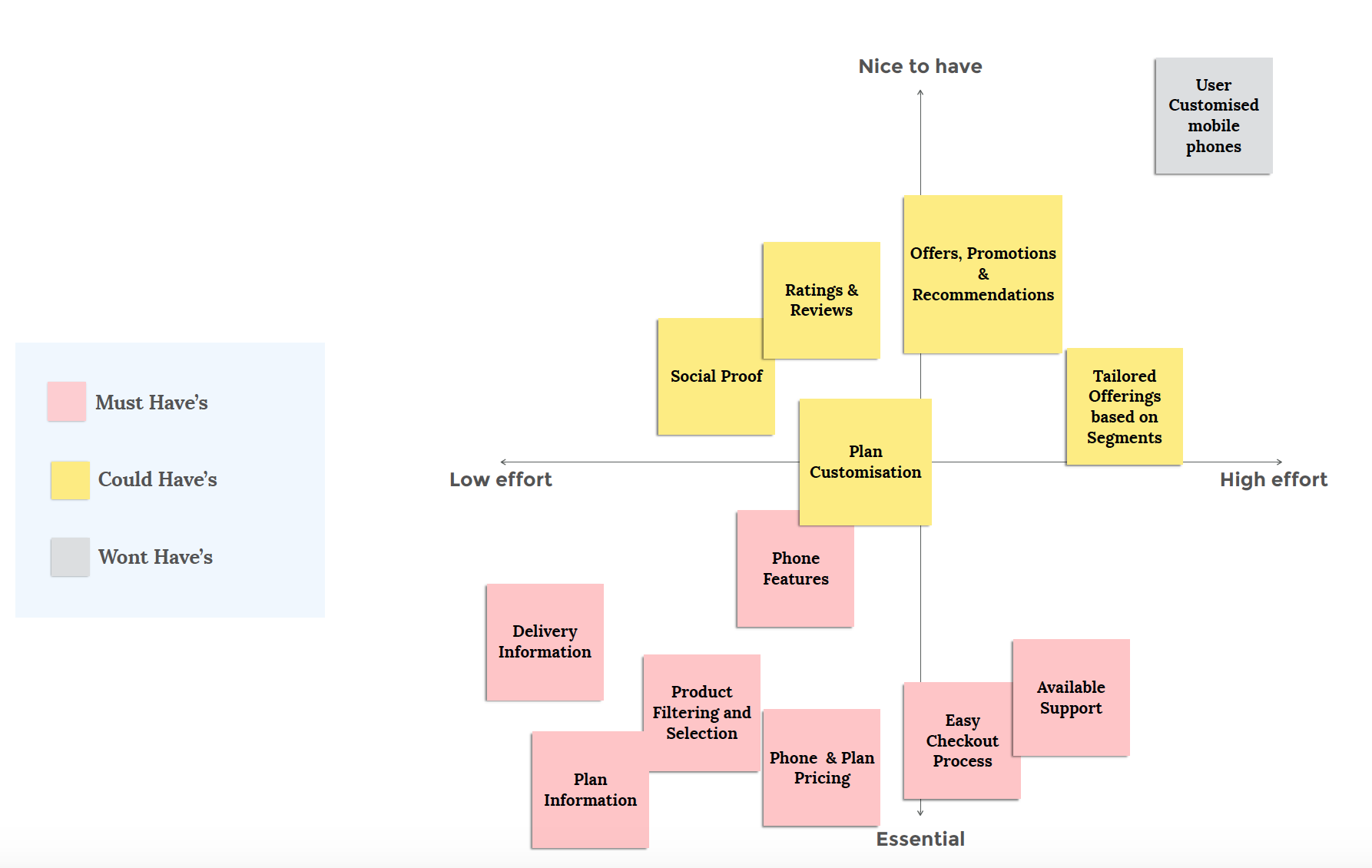
After flushing out potential features, it's always a good idea to map back to major pain points. This is to understand whether the features have addressed key frustrations or opportunities.
To focus on creating a solid MVP, I removed excess noise and feature creep by placing all ideas and solutions on a prioritisation map which are agreed with my stakeholders and the sprint team.
Ideate
After developing the user journeys, I started sketching a solution that supported all user scenarios and overall objectives. Keeping my design flow in low-fidelity allowed validate learning and continuous improvements to iterate quicker.
Know your personas and cater your designs for.
Anything not of immediate use is noise.
Get feedback early and iterate fast.